Description
SPECIFICATIONS
Brand Name: NoEnName_Null
With Water Dispenser: No
Power Source: Battery
Min Output: 50g
Max Output: 500g
Time Setting: Yes
Material: Stainless Steel
Origin: US(Origin)
LCD Display: No
Is Smart Device: YES
Material: Stainless Steel
Target Species: Dog
Recommended Uses For Product: Multiple Pets
Special Feature: Timer, Dishwasher Safe


About this item
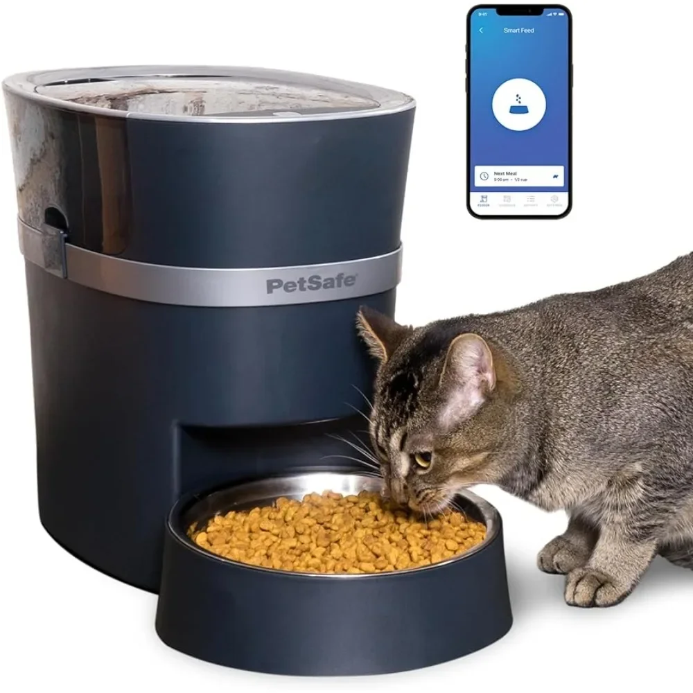
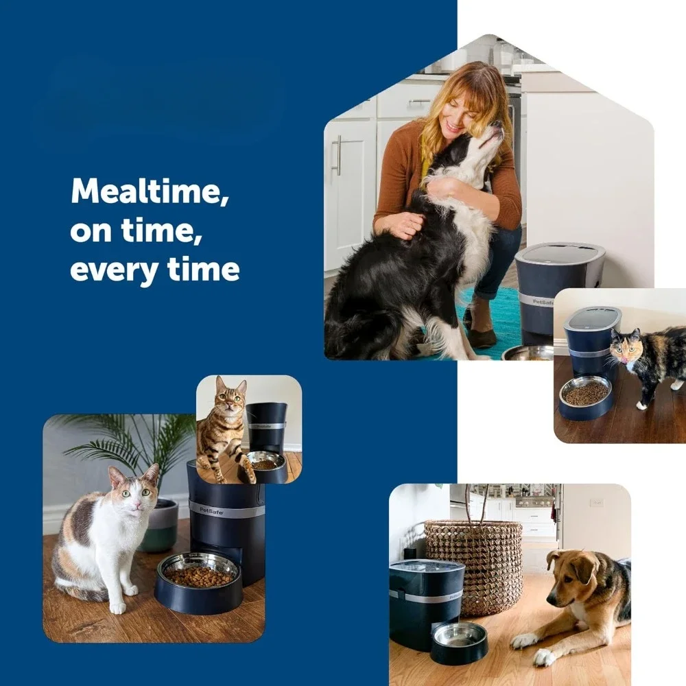
- 2020 PET INNOVATION AWARD WINNER – Received the award for “Electronic Feeders/Waterers Product of the Year” for its innovative design to ensure your pet is fed on time every time
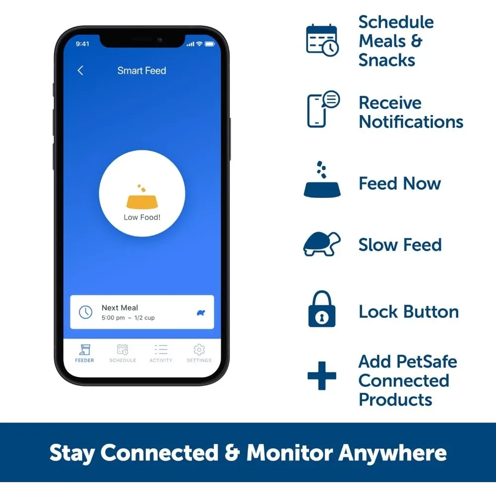
- SMARTPHONE NOTIFICATIONS: The pet feeder will send a notification to your smartphone when the feeder is running low or empty, or if there is an error with the feeder
- FEED YOUR PET WITH OUR APP: Use the My app to monitor your pet’s meals from anywhere; app requires an iPhone or iPod device iOS 12.0 or later or a compatible Android smartphone 9.0 or later
- GREAT FOR PETS WHO EAT TOO QUICKLY: Slow Feed setting dispenses meals larger than 1/8 cup in small amounts over 15 minutes
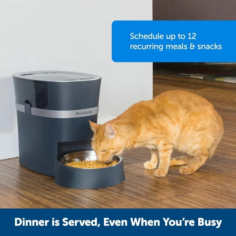
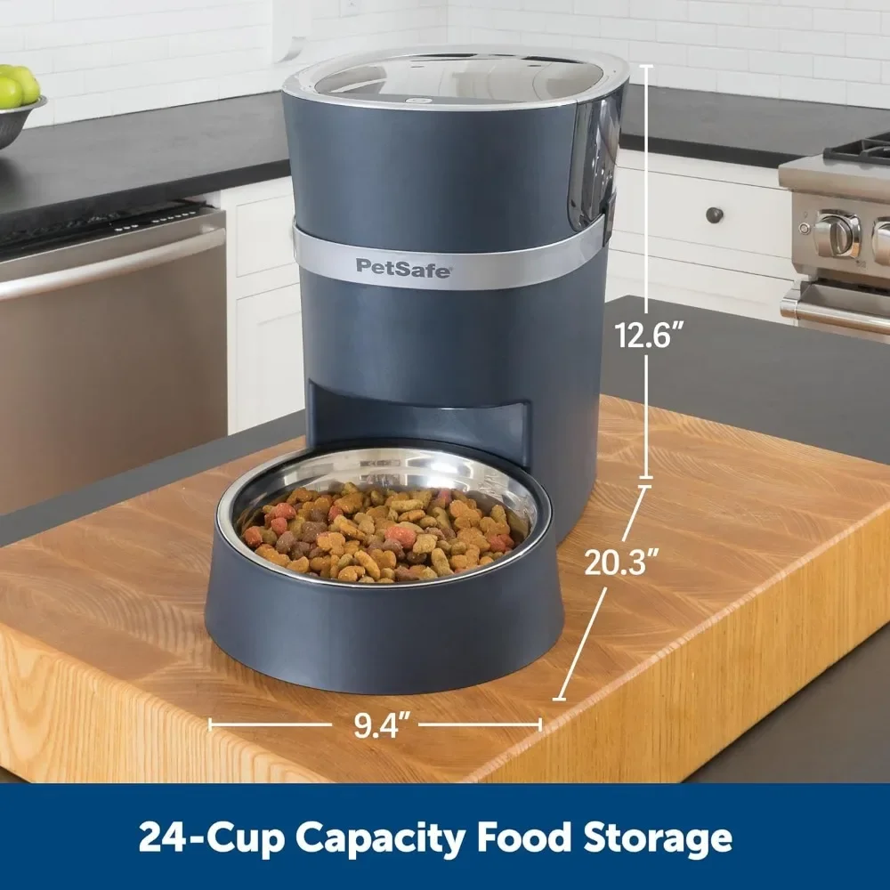
- FLEXIBLE PORTIONS: Schedule up to 12 meals daily that can be dispensed from 1/8 cup to 4 cups to fit your pet’s needs; If you need to temporarily stop the feeder from dispensing you can turn off the schedule in the app
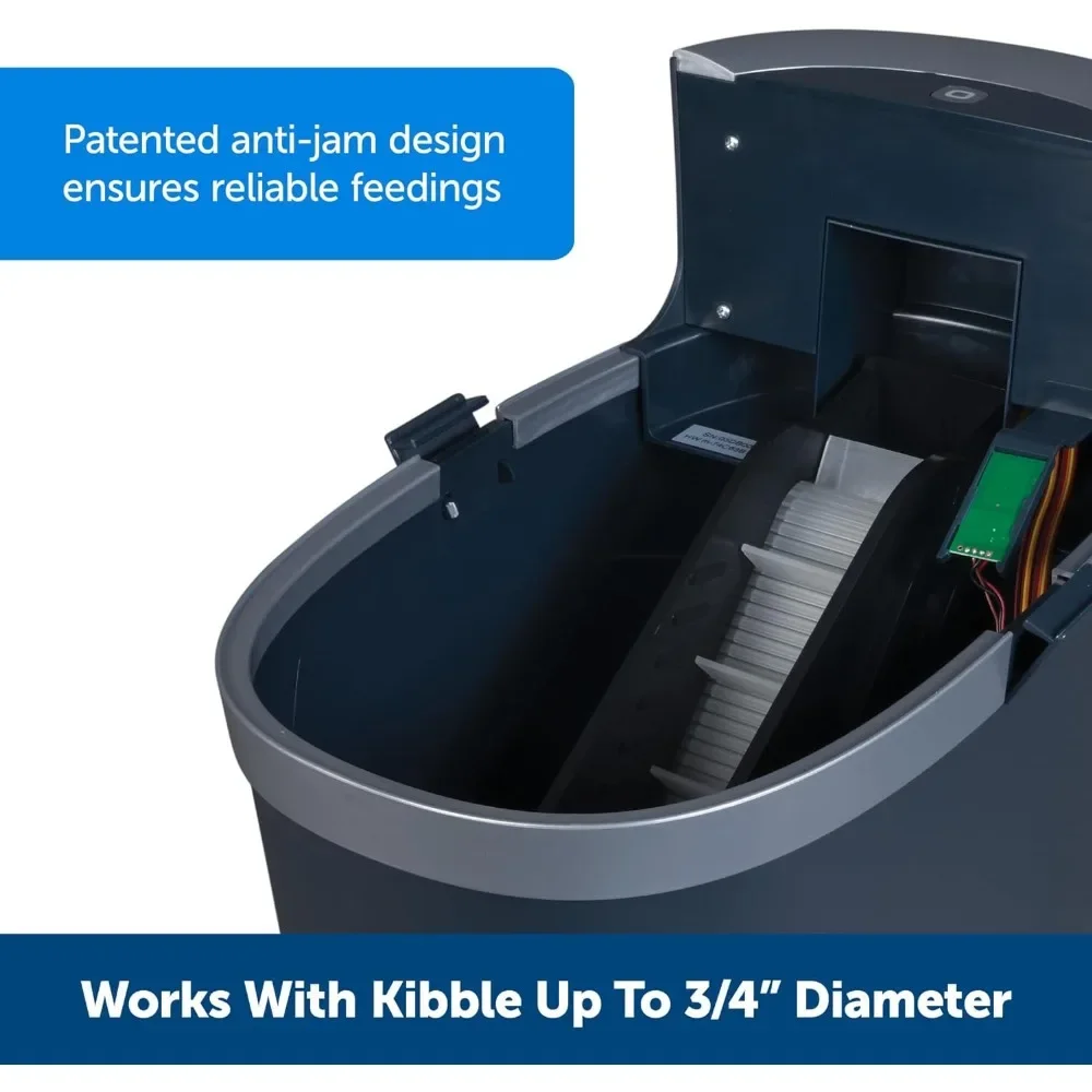
- TOP-RACK DISHWASHER SAFE: Lid, hopper, bowl and bowl holder are top-rack dishwasher-safe for convenient cleaning
#productDescription h3 {
margin: 0.75em 0px 0.375em -1px;
}
.aplus-v2 .apm-brand-story-carousel-container {
position: relative;
}
.aplus-v2 .apm-brand-story-carousel-hero-container,
.aplus-v2 .apm-brand-story-carousel-hero-container > div {
position: absolute;
width: 100%;
}
/*
Ensuring the carousel takes only the space it needs.
The sizes need to be set again on the absolutely positioned elements so they can take up space.
*/
.aplus-v2 .apm-brand-story-carousel-container,
.aplus-v2 .apm-brand-story-carousel-hero-container {
height: 625px;
width: 100%;
max-width: 1464px;
margin-left: auto;
margin-right: auto;
overflow: hidden;
}
/*
This centers the carousel vertically on top of the hero image container and after the logo area (125px).
Margin-top = (heroHeight – cardHeight – logoAreaHeight) / 2 + logoAreaHeight
*/
.aplus-v2 .apm-brand-story-carousel .a-carousel-row-inner{
margin-top: 149px;
}
/*
Cards need to have a width set, otherwise they default to 50px or so.
All cards must have the same width. The carousel will resize itself so all cards take the width of the largest card.
The left margin is for leaving a space between each card.
*/
.aplus-v2 .apm-brand-story-carousel .a-carousel-card {
width: 362px;
margin-left: 30px !important;
}
/* styling the navigation buttons so they are taller, flush with the sides, and have a clean white background */
.aplus-v2 .apm-brand-story-carousel .a-carousel-col.a-carousel-left,
.aplus-v2 .apm-brand-story-carousel .a-carousel-col.a-carousel-right {
padding: 0px;
}
.aplus-v2 .apm-brand-story-carousel .a-carousel-col.a-carousel-left .a-button-image,
.aplus-v2 .apm-brand-story-carousel .a-carousel-col.a-carousel-right .a-button-image {
border: none;
margin: 0px;
}
.aplus-v2 .apm-brand-story-carousel .a-carousel-col.a-carousel-left .a-button-image .a-button-inner,
.aplus-v2 .apm-brand-story-carousel .a-carousel-col.a-carousel-right .a-button-image .a-button-inner {
background: #fff;
padding: 20px 6px;
}
.aplus-v2 .apm-brand-story-carousel .a-carousel-col.a-carousel-left .a-button-image .a-button-inner {
border-radius: 0px 4px 4px 0px;
}
.aplus-v2 .apm-brand-story-carousel .a-carousel-col.a-carousel-right .a-button-image .a-button-inner {
border-radius: 4px 0px 0px 4px;
}




Reviews
There are no reviews yet.